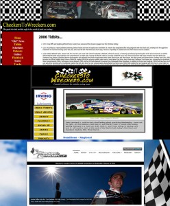
We are pleased to introduce you to the latest, greatest, version of CheckersToWreckers.com.
It is hard to believe it has been over three years since we last refreshed the site to take advantage of the latest technology and, wow, has technology advanced since then.

The evolution of CheckersToWreckers.com site design (top to bottom: 2006, 2007 to 2010, 2011 to 2013.
With this newest version you will find an ultra modern dynamic design with which you will be able to access all our news all the time, no matter where you are, whatever the device. This site is responsive so it automatically optimizes the viewing for the device you are using. It is also retina-ready; that means if you are using an HD device then you’ll view the images in crystal clear high definition. And because it is responsive there is no app required for mobile devices – simply save to your home screen for easy access.
The home page layout is virtually identical to the former site layout – it just looks different – but easier to view and to navigate. And speaking of navigation that is improved too, with a mega menu at the top of every page, primary links at the bottom of every page, a return to top arrow on the lower right corner of every page, and for those viewing on mobile devices – simply swipe to right for a full menu (swipe to the left to hide). Oh, by the way, the mega menu is ‘sticky’ which means it stays at the top even as you scroll down – easy access all the time – try it.
To supersize images contained in stories and galleries simply click on the photo and it will expand in a lightbox layer over the page you are viewing – just click on the ‘x’ to close and return to the page. Many of our articles will be comment-friendly so you will be able to share your views – just remember no links, be friendly, and be courteous – we will remove comments that are not suitable. A convenient search box in located at the top of every page – just click on the magnifying glass icon, enter your search term, and click enter.
Our new ‘Race Central’ section is very cool – it includes schedules for all the series we cover – the default layout is calendar view but you can switch to list view with a quick click in the box on the upper right corner; or you can filter results by dates and/or series. Besides advance event info each event page will include results. For convenience you will find the next few upcoming events on the sidebar of every page of the site.
And because we appreciate Ken MacIsaac’s contribution to our site so much we’ve given him his own section called ‘KenZone’ – moving forward all of his great articles and galleries will be under one umbrella.
Another new feature is the video module on the home page where we will feature favourite video clips – they may be current or classic – you will have to watch to see.
Same concept for the Photo of the Day module at the bottom of the home page – current or classic – by us or by you – check it out.
Social media links at the end of every article make it easy for you to share your favourite articles with your friends – just click and post.
Lastly, and equally important as the new user friendly features, are the sponsor modules you will find on the home page and throughout the site that provide even more great exposure for our partners. Please be sure to support them whenever you can – it is their support that keep the site going.
We’ve got lots of ideas for expanding our site in the future. This new platform will allow us to do that seamlessly – so stay tuned.
We hope you enjoy the new look.
Thanks for your continued support.

